The album cover look
The album cover look
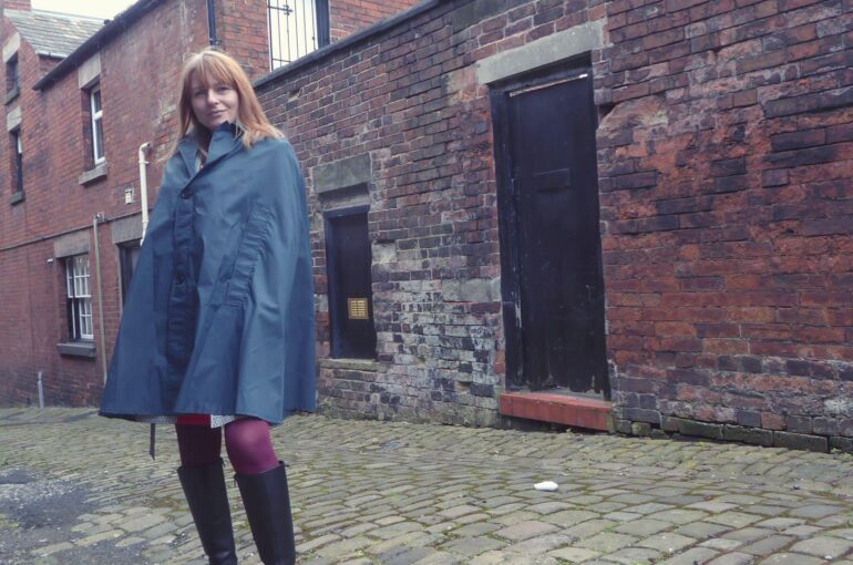
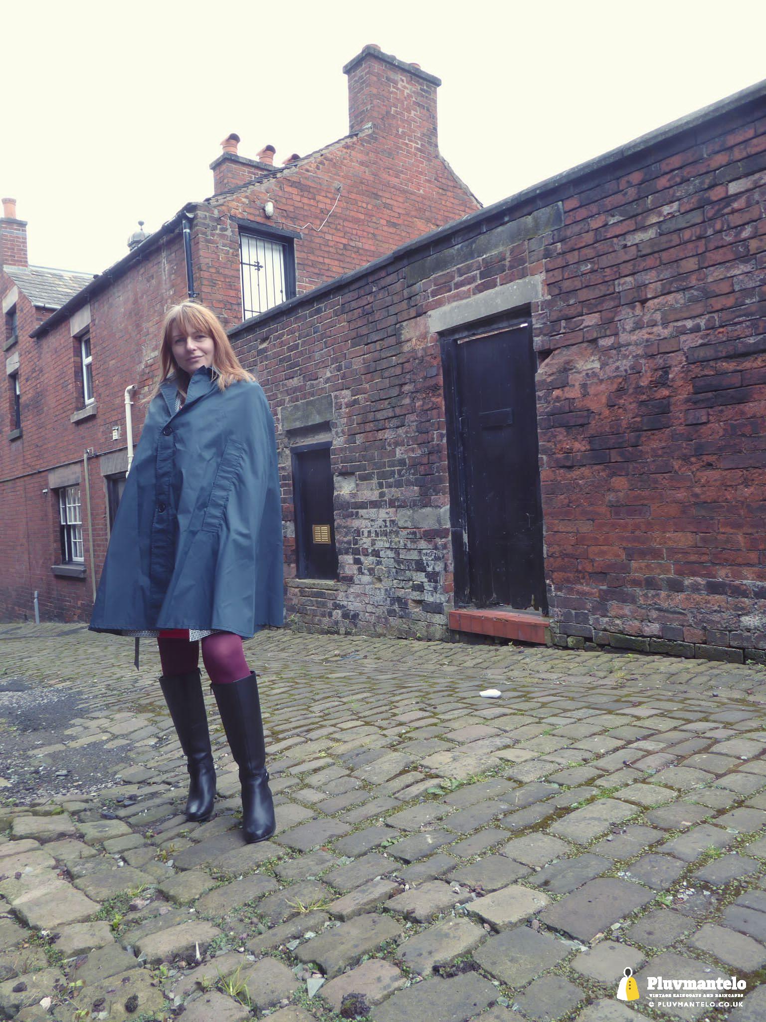
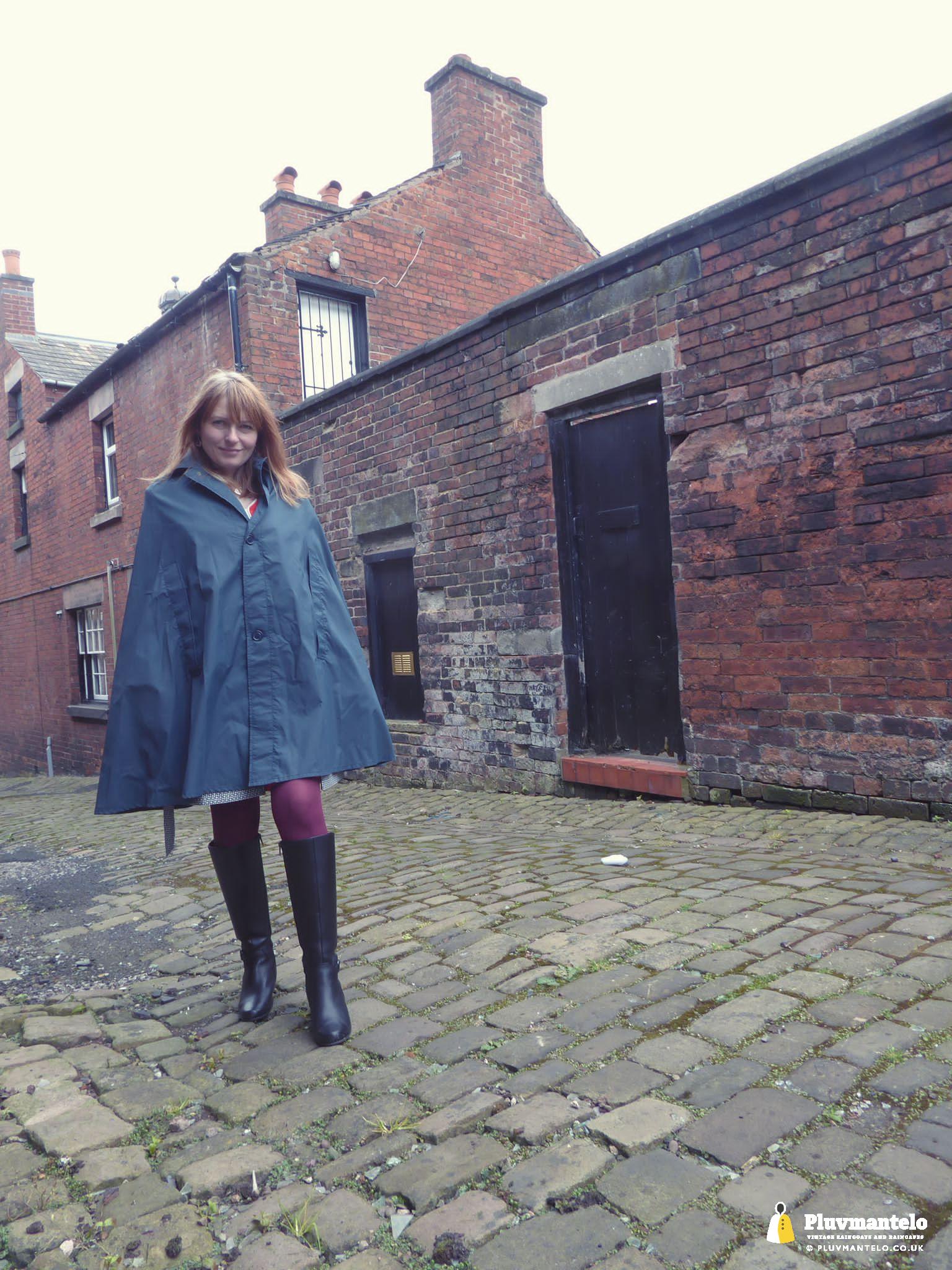
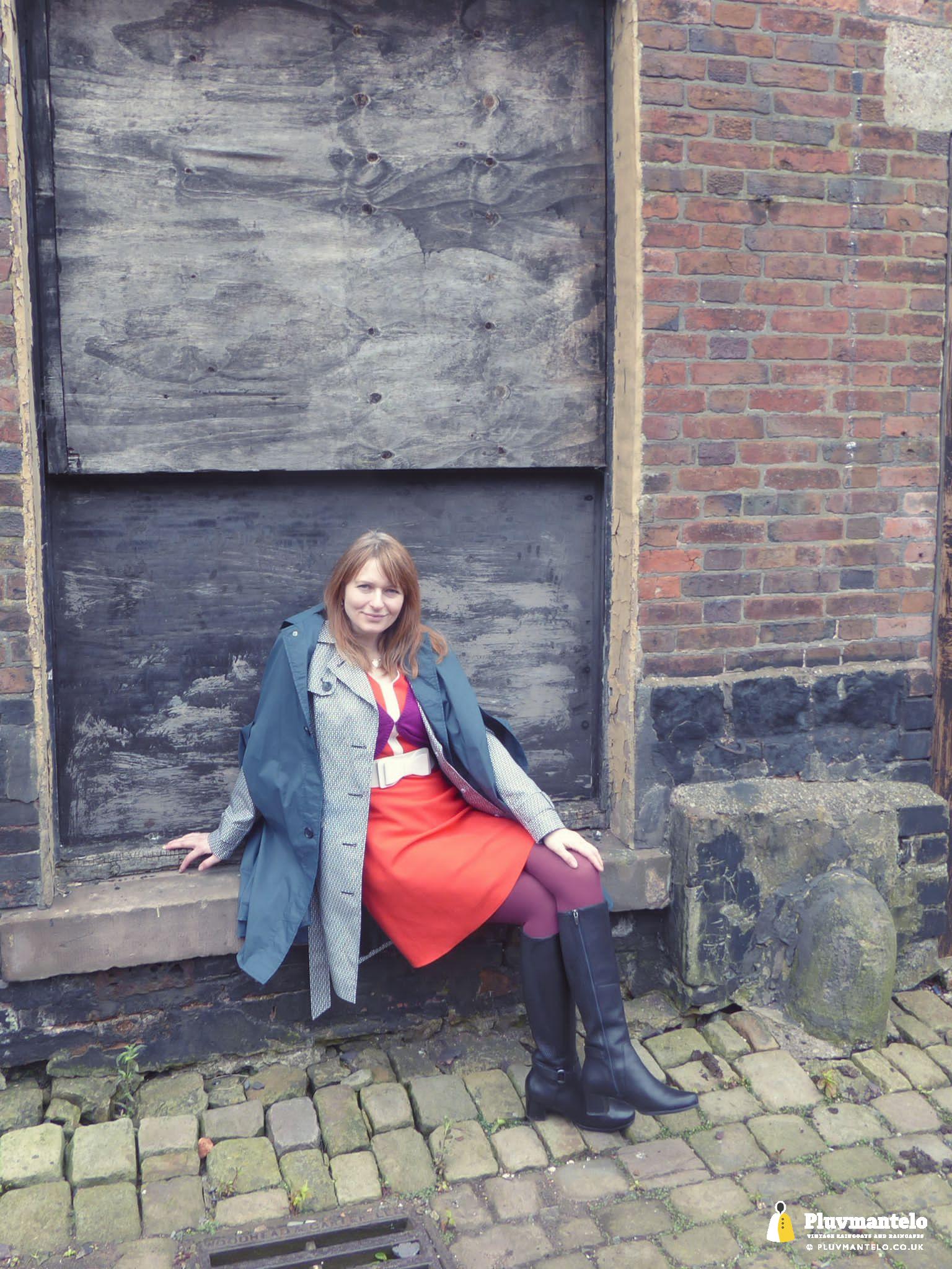
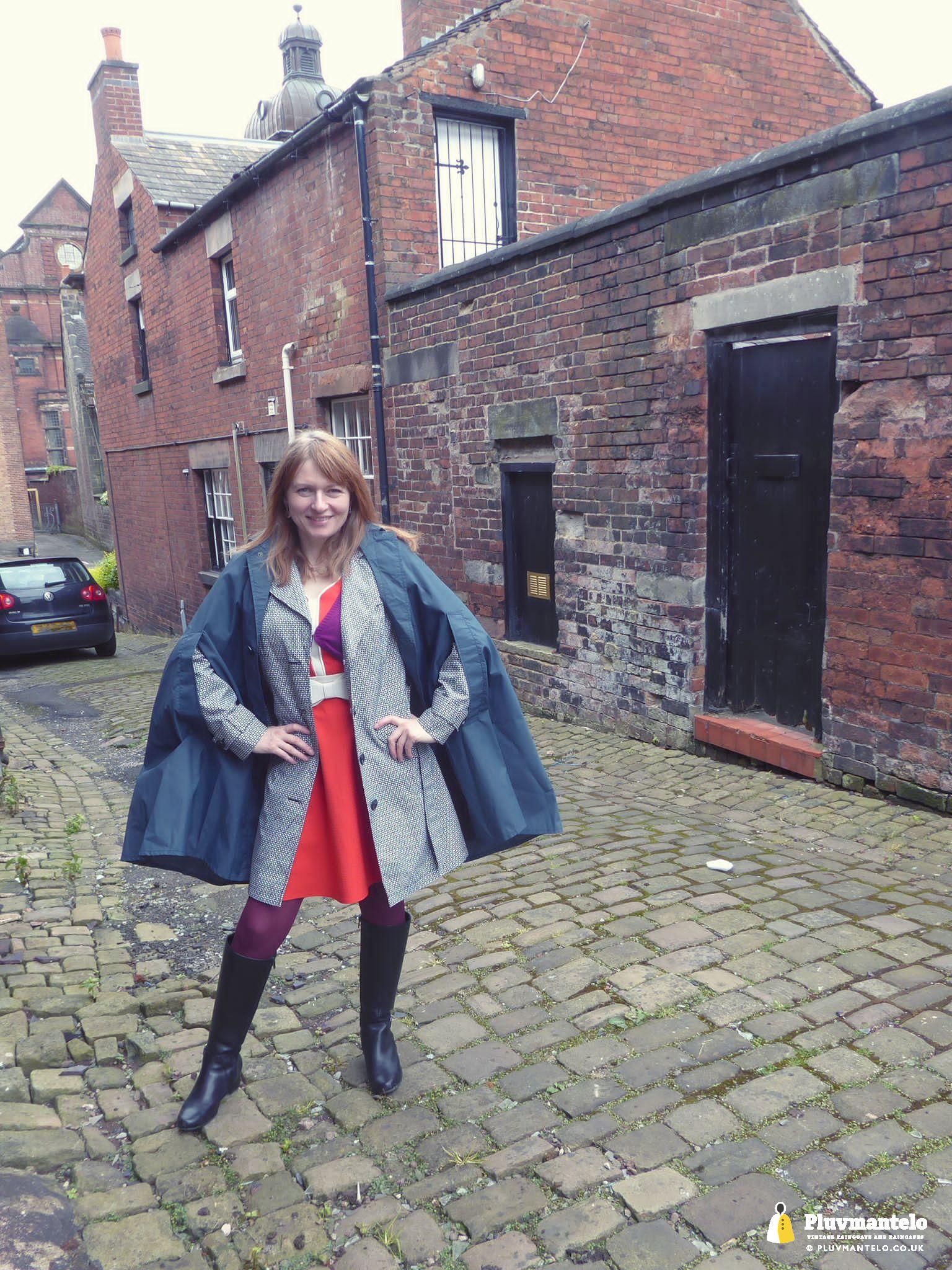
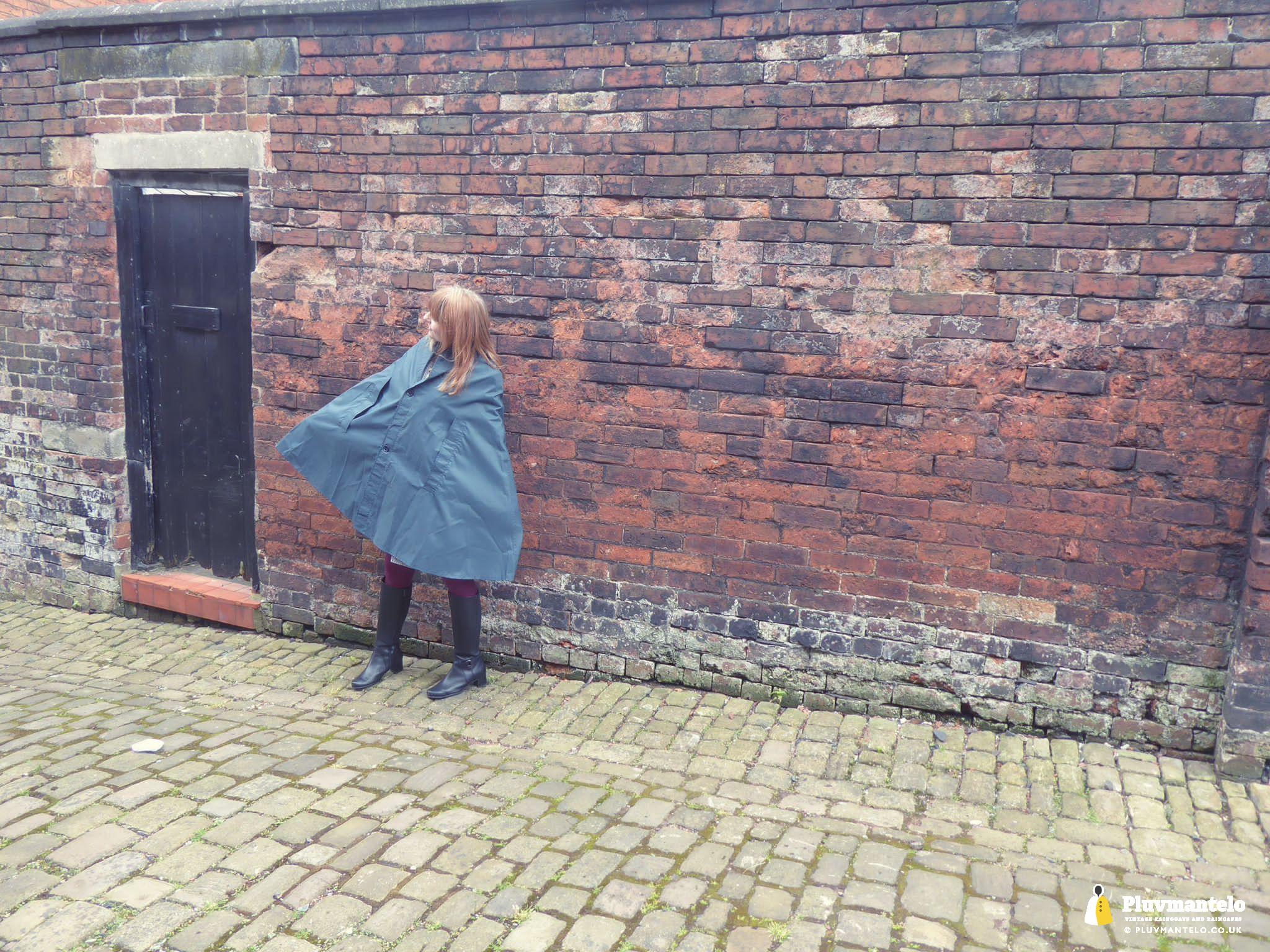
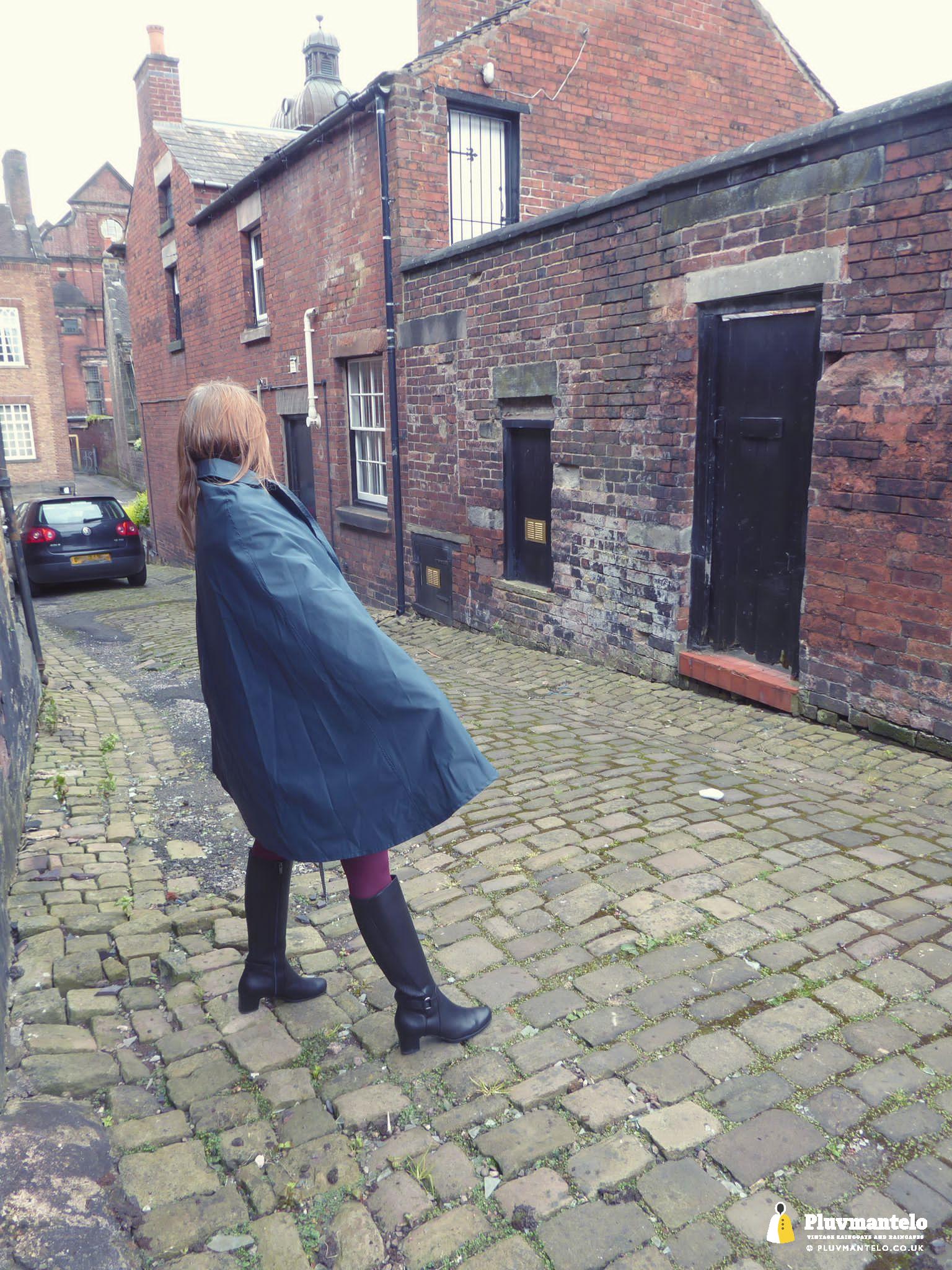
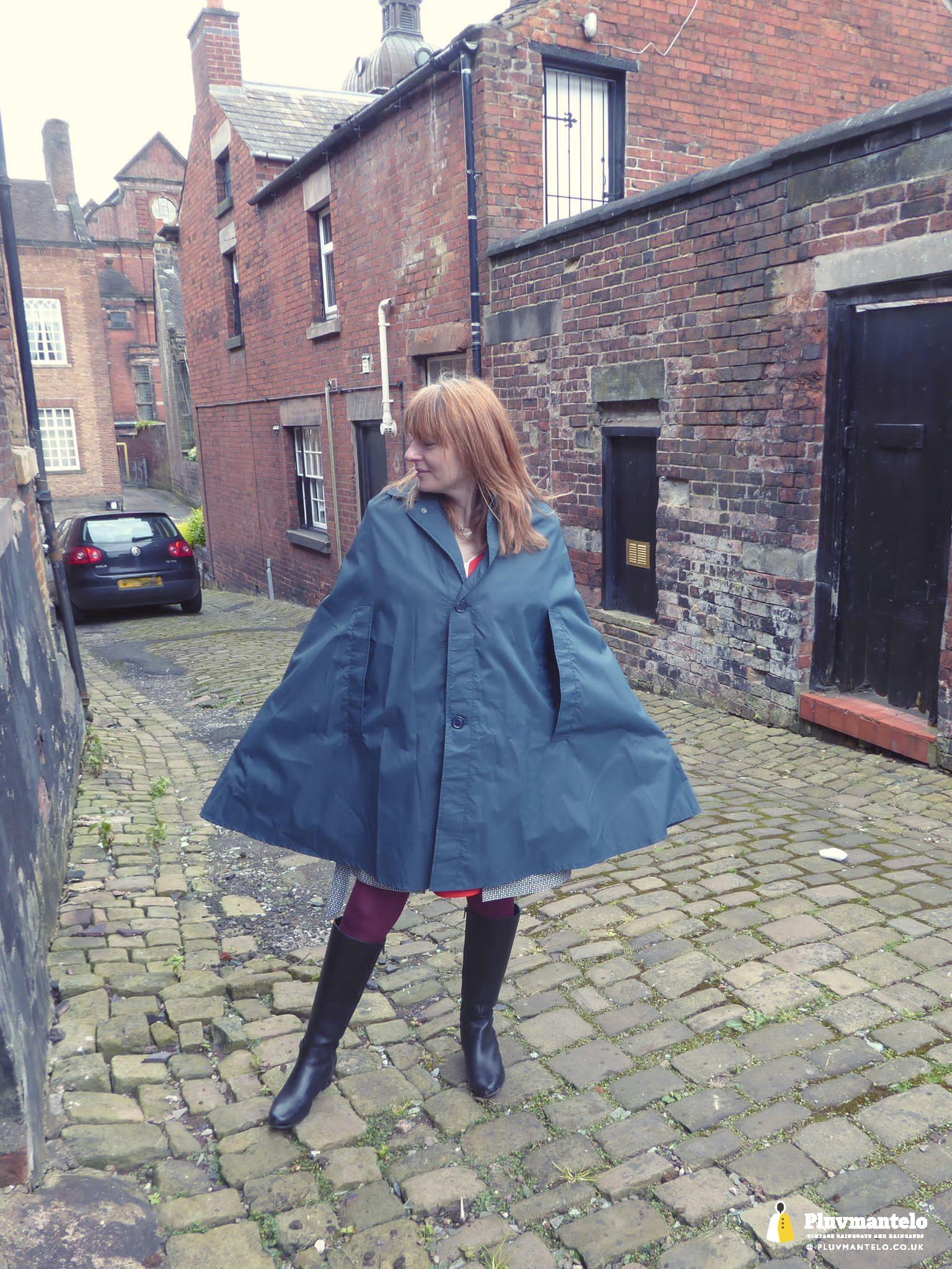
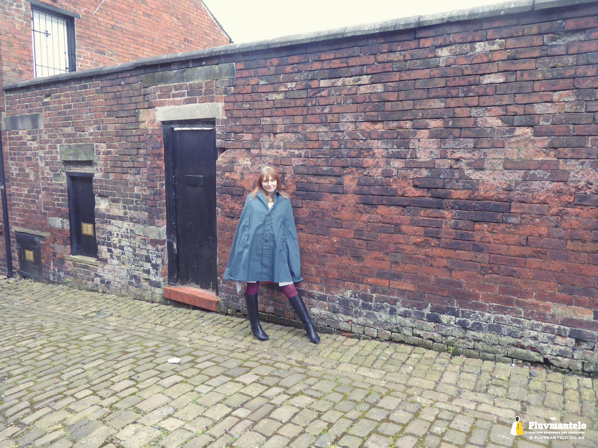
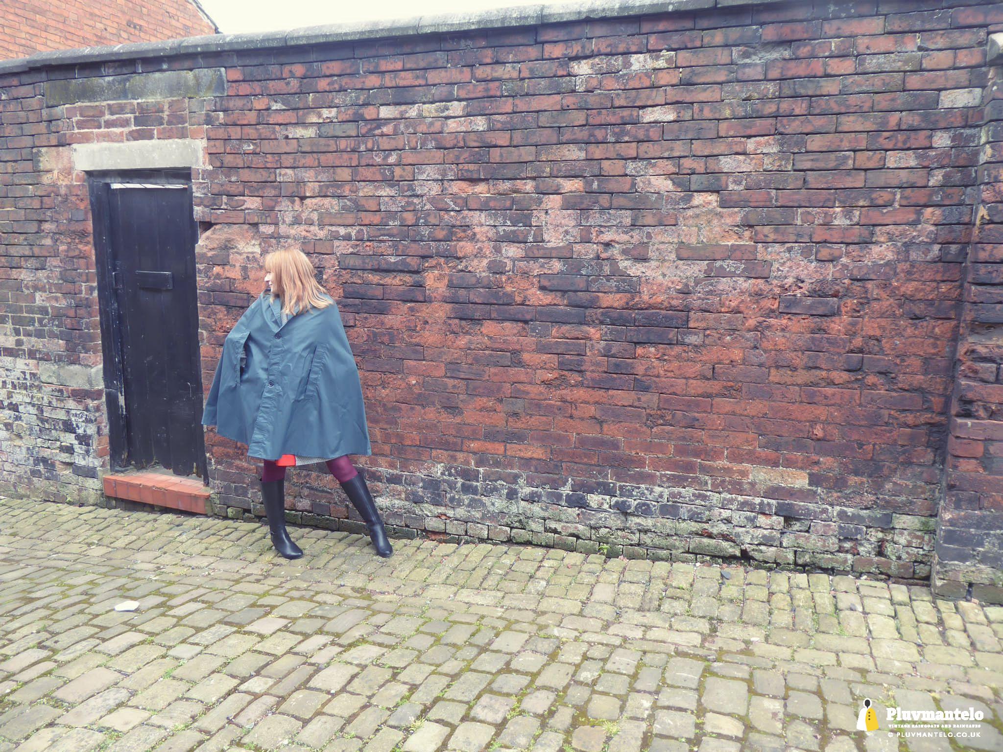
It doesn’t take long for any shoot with Clair the Cape Queen to start talking about album covers: let’s face it, LP cover design was in a world of its own, pushing an artist as quickly as possible as you flicked through the album racks.
It’s something that especially influences our urban shoots and the walls in the background here reminded us of a John Mayall cover – the one where Eric’s reading The Beano. OK, there was no graffiti on the walls in our shoot, but the effect was very similar.
Here’s Clair in an American, 1960s nylon number which looks the part and it certainly kept her dry as the clouds above that part of Mercia decided rain was the order of the day.
And remember, the Pluvmantelo shop is now open for business…
Related Posts
Two for the price of one
It’s a double-header from The Cape Queen as Clair managed to wear two capes on a …

Getting ready to go out
The clocks have changed, the daffodils are still out but…. It’s still cold and it’s still …

The Cape Queen’s shortest…
Welcome to The Cape Queen’s shortest cape, a recently bought glossy black pvc number that’s certainly …
Featured Posts

Two for the price of one

Getting ready to go out

The Cape Queen’s shortest…

3 Comments
I have seen some very nice rubberised Capes on your site today . Black rubberised one , and the blue satin one . The green army one I particularly liked and it brought back some nice memories from when I owned one several years ago . Congratulations and keep up the good work .
Many Thanks for your kind words – greatly appreciated
Thank you Kindly Peter. I really do appreciate the wonderful feedback from yourself. I love the green army cape. It sits very well. Do you still have yours? Kindest regards Clair.